Cell-Cell Interaction Analysis
The overall steps in the stLearn cell-cell interaction (CCI) analysis pipeline are:
1. Load known ligand-receptor gene pairs.
2. Identify spots where significant interactions between these pairs occur.
3. For each LR pair and each celltype-celltype combination,
    count the instances where neighbours of a signficant spot
    for that LR pair link two given cell types.
4. Identify signficant interactions with p<.05 from cell type information permutation.
5. Visualise the CCI results.
Ligand-Receptor Analysis
The first step in the stLearn CCI pipeline is the ligand-receptor (LR) analysis.
This analysis calls significant spots of ligand-receptor interactions from a database of candidate ligand-receptors.
Run-time will heavily depend on the dataset & compute resources available; note that multi-threading capability is implemented.
Environment setup
[1]:
import os
import platform
import random

# Make sure all the seeds are set
seed = 0
random.seed(seed)
os.environ['PYTHONHASHSEED'] = str(seed)

# Only constrain threads on macOS where BLAS/numba deadlocks are common.
# Must run before any numpy/scanpy import.
if platform.system() == "Darwin":
    os.environ["OPENBLAS_NUM_THREADS"] = "1"
    os.environ["MKL_NUM_THREADS"] = "1"
    os.environ["NUMBA_NUM_THREADS"] = "1"
    n_cpus = 1
else:
    n_cpus = None
[2]:
import stlearn as st
import pandas as pd
import pathlib
import matplotlib.pyplot as plt
import numpy as np

np.random.seed(seed)
st.settings.set_figure_params(dpi=120)

# Ignore all warnings
import warnings

warnings.filterwarnings("ignore")
[3]:
# Setup download directory and get data
st.settings.datasetdir = pathlib.Path.cwd().parent / "data"
sample_id = "V1_Breast_Cancer_Block_A_Section_1"
block1 = st.datasets.visium_sge(sample_id=sample_id)
block1 = st.convert_scanpy(block1)
Data Loading & Preprocessing
Note we don’t log1p the data for the LR analysis.
[4]:
# Basic normalisation #
st.pp.filter_genes(block1, min_cells=3)
st.pp.normalize_total(block1)  # NOTE: no log1p
Normalization step is finished in adata.X
[5]:
# Adding the label transfer results
project_root = pathlib.Path.cwd().parent
annotation_path = project_root / "annotations"
cell_types = annotation_path / f"{sample_id}_cell_type_proportions.csv"
spot_mixtures = pd.read_csv(cell_types, index_col=0)
spot_mixtures
[5]:
| Endothelial | CAFs | PVL | B-cells | T-cells | Myeloid | Normal Epithelial | Plasmablasts | Cancer Epithelial | |
|---|---|---|---|---|---|---|---|---|---|
| id | |||||||||
| AAACAAGTATCTCCCA-1 | 4.408002e-08 | 1.344865e-01 | 1.163032e-05 | 1.227270e-08 | 2.295571e-15 | 7.177038e-02 | 2.895089e-03 | 0.710977 | 7.985977e-02 |
| AAACACCAATAACTGC-1 | 1.171519e-07 | 1.374211e-03 | 4.819937e-03 | 1.112235e-10 | 4.900738e-12 | 1.146527e-06 | 1.117701e-02 | 0.052059 | 9.305690e-01 |
| AAACAGAGCGACTCCT-1 | 3.391671e-02 | 1.936128e-01 | 2.727795e-02 | 4.451080e-04 | 2.502903e-11 | 4.681284e-02 | 2.960148e-03 | 0.407055 | 2.879199e-01 |
| AAACAGGGTCTATATT-1 | 2.218915e-15 | 4.154082e-11 | 2.590493e-15 | 2.262676e-14 | 1.393533e-24 | 7.183441e-11 | 1.015703e-14 | 1.000000 | 2.528053e-16 |
| AAACAGTGTTCCTGGG-1 | 1.013191e-07 | 1.529676e-01 | 6.344583e-04 | 3.170551e-12 | 5.254014e-14 | 3.290586e-04 | 4.684718e-03 | 0.076279 | 7.651046e-01 |
| ... | ... | ... | ... | ... | ... | ... | ... | ... | ... |
| TTGTTGTGTGTCAAGA-1 | 2.754395e-08 | 6.213241e-02 | 1.627493e-03 | 3.769111e-05 | 2.289319e-11 | 4.615246e-02 | 8.118926e-03 | 0.075952 | 8.059793e-01 |
| TTGTTTCACATCCAGG-1 | 5.099808e-05 | 8.506021e-02 | 9.885762e-03 | 4.234758e-06 | 2.160174e-10 | 2.123389e-01 | 9.587400e-03 | 0.102382 | 5.806904e-01 |
| TTGTTTCATTAGTCTA-1 | 1.268465e-05 | 4.958436e-02 | 9.410104e-03 | 1.736694e-09 | 3.880088e-12 | 1.701309e-04 | 1.462710e-02 | 0.067921 | 8.582742e-01 |
| TTGTTTCCATACAACT-1 | 4.913381e-05 | 3.794668e-01 | 6.773481e-04 | 1.162436e-03 | 1.674868e-07 | 3.836030e-02 | 5.926389e-04 | 0.304768 | 2.749229e-01 |
| TTGTTTGTGTAAATTC-1 | 2.284275e-07 | 5.668434e-03 | 6.644045e-03 | 6.492100e-06 | 5.853031e-14 | 3.053288e-02 | 1.407399e-02 | 0.125464 | 8.176102e-01 |
3798 rows × 9 columns
[6]:
aligned_spot_mixtures = spot_mixtures.reindex(block1.obs_names, fill_value=0)
aligned_spot_mixtures
[6]:
| Endothelial | CAFs | PVL | B-cells | T-cells | Myeloid | Normal Epithelial | Plasmablasts | Cancer Epithelial | |
|---|---|---|---|---|---|---|---|---|---|
| AAACAAGTATCTCCCA-1 | 4.408002e-08 | 1.344865e-01 | 1.163032e-05 | 1.227270e-08 | 2.295571e-15 | 7.177038e-02 | 2.895089e-03 | 0.710977 | 7.985977e-02 |
| AAACACCAATAACTGC-1 | 1.171519e-07 | 1.374211e-03 | 4.819937e-03 | 1.112235e-10 | 4.900738e-12 | 1.146527e-06 | 1.117701e-02 | 0.052059 | 9.305690e-01 |
| AAACAGAGCGACTCCT-1 | 3.391671e-02 | 1.936128e-01 | 2.727795e-02 | 4.451080e-04 | 2.502903e-11 | 4.681284e-02 | 2.960148e-03 | 0.407055 | 2.879199e-01 |
| AAACAGGGTCTATATT-1 | 2.218915e-15 | 4.154082e-11 | 2.590493e-15 | 2.262676e-14 | 1.393533e-24 | 7.183441e-11 | 1.015703e-14 | 1.000000 | 2.528053e-16 |
| AAACAGTGTTCCTGGG-1 | 1.013191e-07 | 1.529676e-01 | 6.344583e-04 | 3.170551e-12 | 5.254014e-14 | 3.290586e-04 | 4.684718e-03 | 0.076279 | 7.651046e-01 |
| ... | ... | ... | ... | ... | ... | ... | ... | ... | ... |
| TTGTTGTGTGTCAAGA-1 | 2.754395e-08 | 6.213241e-02 | 1.627493e-03 | 3.769111e-05 | 2.289319e-11 | 4.615246e-02 | 8.118926e-03 | 0.075952 | 8.059793e-01 |
| TTGTTTCACATCCAGG-1 | 5.099808e-05 | 8.506021e-02 | 9.885762e-03 | 4.234758e-06 | 2.160174e-10 | 2.123389e-01 | 9.587400e-03 | 0.102382 | 5.806904e-01 |
| TTGTTTCATTAGTCTA-1 | 1.268465e-05 | 4.958436e-02 | 9.410104e-03 | 1.736694e-09 | 3.880088e-12 | 1.701309e-04 | 1.462710e-02 | 0.067921 | 8.582742e-01 |
| TTGTTTCCATACAACT-1 | 4.913381e-05 | 3.794668e-01 | 6.773481e-04 | 1.162436e-03 | 1.674868e-07 | 3.836030e-02 | 5.926389e-04 | 0.304768 | 2.749229e-01 |
| TTGTTTGTGTAAATTC-1 | 2.284275e-07 | 5.668434e-03 | 6.644045e-03 | 6.492100e-06 | 5.853031e-14 | 3.053288e-02 | 1.407399e-02 | 0.125464 | 8.176102e-01 |
3798 rows × 9 columns
[7]:
labels = aligned_spot_mixtures.idxmax(axis=1)
labels.name = "cell_type"
labels
[7]:
AAACAAGTATCTCCCA-1         Plasmablasts
AAACACCAATAACTGC-1    Cancer Epithelial
AAACAGAGCGACTCCT-1         Plasmablasts
AAACAGGGTCTATATT-1         Plasmablasts
AAACAGTGTTCCTGGG-1    Cancer Epithelial
                            ...
TTGTTGTGTGTCAAGA-1    Cancer Epithelial
TTGTTTCACATCCAGG-1    Cancer Epithelial
TTGTTTCATTAGTCTA-1    Cancer Epithelial
TTGTTTCCATACAACT-1                 CAFs
TTGTTTGTGTAAATTC-1    Cancer Epithelial
Name: cell_type, Length: 3798, dtype: object
[8]:
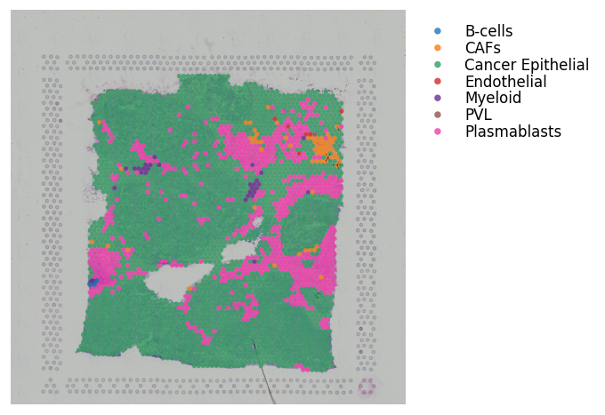
# NOTE: using the same key in data.obs & data.uns
block1.obs['cell_type'] = labels  # Adding the dominant cell type labels per spot
block1.obs['cell_type'] = block1.obs['cell_type'].astype('category')
block1.uns['cell_type'] = aligned_spot_mixtures  # Adding the cell type scores

st.pl.cluster_plot(block1, use_label='cell_type', bbox_to_anchor=(1.52, 1))
[8]:
AnnData object with n_obs × n_vars = 3798 × 22240
    obs: 'in_tissue', 'array_row', 'array_col', 'imagecol', 'imagerow', 'cell_type'
    var: 'gene_ids', 'feature_types', 'genome', 'n_cells'
    uns: 'spatial', 'cell_type', 'cell_type_colors'
    obsm: 'spatial'
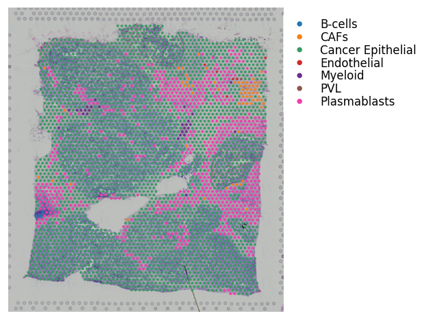
For the above cell type information, note that these results were generated using Seurat.
It’s not necessary to have the cell type scores per spot; you can run with just discrete spot labels.
However, if running with cell type scores, do need to add the dominant cell type to the adata.obs slot with the same key as the cell type scores added to the adata.uns slot; as exemplified above.
Running the Ligand-Receptor Analysis
[9]:
lrs = st.tl.cci.load_lrs(['connectomeDB2020_lit'], species='human')
lrs
[9]:
array(['A2M_LRP1', 'AANAT_MTNR1A', 'AANAT_MTNR1B', ..., 'ZP3_CHRNA7',
       'ZP3_EGFR', 'ZP3_MERTK'], shape=(2293,), dtype='<U18')
[10]:
# Running the analysis #
st.tl.cci.run(block1, lrs,
              min_spots=20,   # Filter out any LR pairs with no scores for less than min_spots
              distance=None,  # None defaults to spot+immediate neighbours; distance=0 for within-spot mode
              n_pairs=100,    # Number of random pairs to generate; low as example, recommend ~10,000
              n_cpus=n_cpus,  # Number of CPUs for parallel. If None, detects & use all available.
              random_state=seed
              )
Calculating neighbours...
0 spots with no neighbours, 6 median spot neighbours.
Spot neighbour indices stored in adata.obsm['spot_neighbours'] & adata.obsm['spot_neigh_bcs'].
Altogether 1548 valid L-R pairs
Generating backgrounds & testing each LR pair...: 100%|████████████████████████████████████████████████████████████████████████████████████████████████████████████████████████████████████████ [ time left: 00:00 ]
Storing results:

lr_scores stored in adata.obsm['lr_scores'].
p_vals stored in adata.obsm['p_vals'].
p_adjs stored in adata.obsm['p_adjs'].
-log10(p_adjs) stored in adata.obsm['-log10(p_adjs)'].
lr_sig_scores stored in adata.obsm['lr_sig_scores'].

Per-spot results in adata.obsm have columns in same order as rows in adata.uns['lr_summary'].
Summary of LR results in adata.uns['lr_summary'].
[11]:
lr_info = block1.uns['lr_summary']  # A dataframe detailing the LR pairs ranked by number of significant spots.
lr_info
[11]:
| n_spots | n_spots_sig | n_spots_sig_pval | |
|---|---|---|---|
| CXCL12_ITGAV | 3052 | 6 | 135 |
| CXCL12_ITGA4 | 2221 | 5 | 134 |
| CCL21_CXCR3 | 791 | 5 | 141 |
| DLL3_NOTCH3 | 1583 | 5 | 140 |
| CXCL12_ITGB1 | 3513 | 5 | 191 |
| ... | ... | ... | ... |
| HP_ITGAM | 112 | 0 | 93 |
| HP_CD163 | 183 | 0 | 136 |
| CCL5_SDC1 | 3522 | 0 | 237 |
| CCL5_CXCR3 | 1849 | 0 | 205 |
| ZP3_MERTK | 388 | 0 | 173 |
1548 rows × 3 columns
P-value adjustment
Below can adjust the p-value using different approaches; the p-value has already been corrected by running st.tl.cci.run. This is what was used for the paper and is the default of the below function. The difference between correct_axis is adjusting by no. of LRs tested per spot (LR), no. of spots tested per LR (spot), or no adjustment (None).
[12]:
st.tl.cci.adj_pvals(block1, correct_axis='spot', pval_adj_cutoff=0.05, adj_method='fdr_bh')
Updated adata.uns[lr_summary]
Updated adata.obsm[lr_scores]
Updated adata.obsm[lr_sig_scores]
Updated adata.obsm[p_vals]
Updated adata.obsm[p_adjs]
Updated adata.obsm[-log10(p_adjs)]
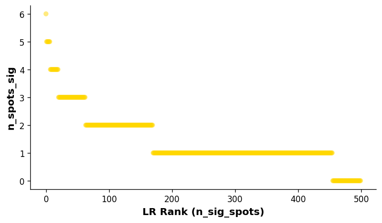
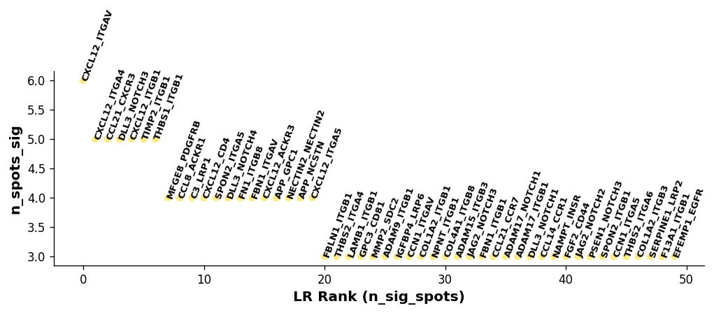
Visualise the overall ranking of LRs by significant spots
[13]:
# Showing the rankings of the LR from a global and local perspective.
# Ranking based on number of significant hotspots.
st.pl.lr_summary(block1, n_top=500)
st.pl.lr_summary(block1, n_top=50, figsize=(10, 3))
Diagnostic plots
A key aspect of the LR analysis is to control for LR expression level and frequency when calling significant hotspots.
Hence, our diagnostic plots should show next to no correlation between the hotspots of the LR pairs and the expression level and frequency of expression.
The following diagnostics allow us to check and make sure this is the case; if not, could indicate a larger number of permutations is required.
[14]:
st.pl.lr_diagnostics(block1, figsize=(10, 2.5))
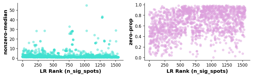
Left plot: Relationship between LR expression level (non-zero spots average median expression of genes in the LR pair) and the ranking of the LR.
Right plot: Relationship between LR expression frequency (average proportion of zero spots for each gene in the LR pair) and the ranking of the LR.
In this case, there is a weak correlation between the LR expression frequency and number of significant spots, indicating the n_pairs parameter should be set higher to create more accurate background distributions (10,000 pairs was used in the case of the paper version of the above).
[15]:
st.pl.lr_n_spots(block1, n_top=50, figsize=(11, 3),
                 max_text=100)
st.pl.lr_n_spots(block1, n_top=500, figsize=(11, 3),
                 max_text=100)
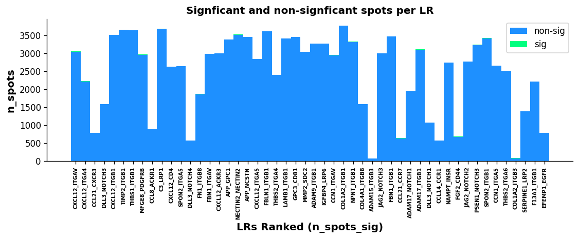
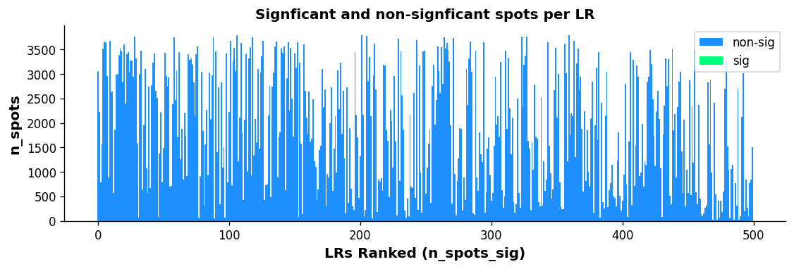
The above boxplots show the number of spots with ligand-receptor scores for each LR on the y-axis, with the LR ranking on the x-axis. The bar area is stratified by spots which were significant (green) and non-significant (blue).
While the trend isn’t as quantitative with this plot compared with the scatter plot, there does appear to be some correlation with more highly frequent LR pairs and LR ranking; again indicating the n_pairs parameter above should be set higher.
Biologic Plots (Optional)
Having examined whether we still see a correlation with the technical factors via diagnostic plots, let’s now examine whether we see biological enrichment of the genes in the top LR pairs as a prognostic we are performing some biological inference.
For this to work, it requires R installed with clusterProfiler, org.Mm.eg.db, and org.Hs.eg.db.
To install R, we recommend using conda. For the R dependencies, please see the following links for installation: clusterProfiler, org.Hs.eg.db, org.Mm.eg.db.
To get the path to your R installation, simply type the following into your terminal: which R
[16]:
## Running the GO enrichment analysis ##
# r_path = "/Library/Frameworks/R.framework/Resources"
# st.tl.cci.run_lr_go(block1, r_path)
[17]:
# st.pl.lr_go(block1, lr_text_fp={'weight': 'bold', 'size': 10}, rot=15,
#                figsize=(12,3.65), n_top=15, show=False)
Overall, we see some strong biological enrichment, indicating some potential pathways mediated by the top LR pairs.
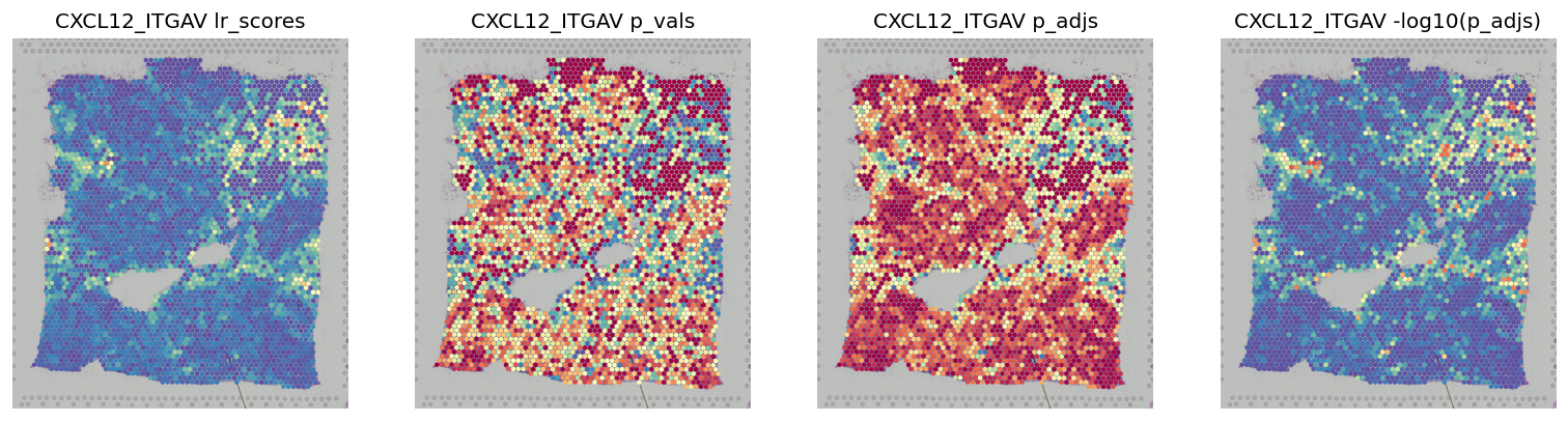
LR Statistics Visualisations
The lr_result_plot displays LR analysis spot statistics for particular LR pairs in the spatial context.
Different values to plot are stored in .obsm, & include: lr_scores, p_vals, p_adjs, -log10(p_adjs), lr_sig_scores
[18]:
best_lr = block1.uns['lr_summary'].index.values[0] # Just choosing one of the top from lr_summary
[19]:
stats = ['lr_scores', 'p_vals', 'p_adjs', '-log10(p_adjs)']
fig, axes = plt.subplots(ncols=len(stats), figsize=(16, 6))
for i, stat in enumerate(stats):
    st.pl.lr_result_plot(block1, use_result=stat, use_lr=best_lr, show_color_bar=False, ax=axes[i])
    axes[i].set_title(f'{best_lr} {stat}')
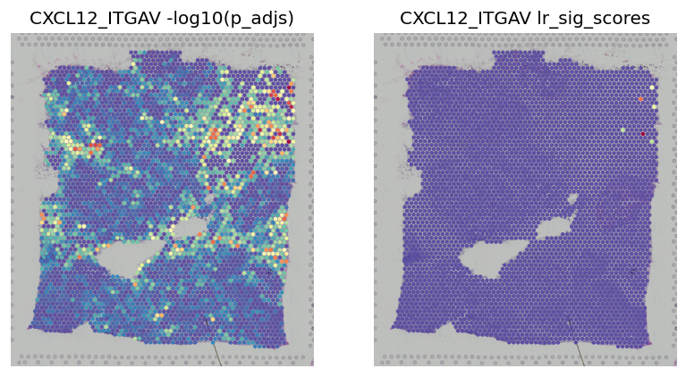
This shows the scores -log10(p_adjs) for all spots, then the scores subseted to significant spots
[20]:
fig, axes = plt.subplots(ncols=2, figsize=(8, 6))
st.pl.lr_result_plot(block1, use_result='-log10(p_adjs)', use_lr=best_lr, show_color_bar=False, ax=axes[0])
st.pl.lr_result_plot(block1, use_result='lr_sig_scores', use_lr=best_lr, show_color_bar=False, ax=axes[1])
axes[0].set_title(f'{best_lr} -log10(p_adjs)')
axes[1].set_title(f'{best_lr} lr_sig_scores')
[20]:
Text(0.5, 1.0, 'CXCL12_ITGAV lr_sig_scores')
LR Interpretation Visualisations
These visualisations are meant to help interpret the directionality of the cross-talk.
Binary LR coexpression plot for all spots
[21]:
st.pl.lr_plot(block1, best_lr, inner_size_prop=0.1, outer_mode='binary', pt_scale=5,
              use_label=None, show_image=True,
              sig_spots=False, bbox_to_anchor=(1.5, 1))
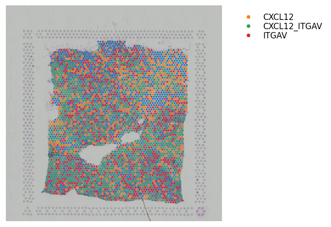
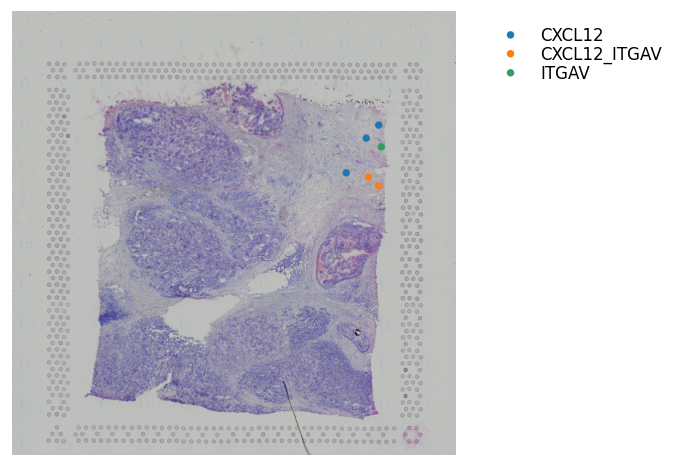
Binary LR coexpression plot for significant spots
[22]:
st.pl.lr_plot(block1, best_lr, outer_size_prop=1, outer_mode='binary', pt_scale=20,
              use_label=None, show_image=True,
              sig_spots=True, bbox_to_anchor=(1.5, 1))
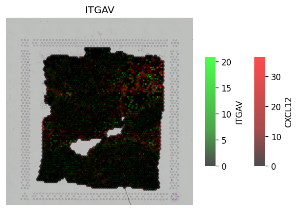
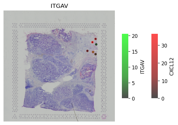
Continuous LR coexpression for significant spots
The receptor is in green, the ligand is in red. The inner-point is the receptor, the outter point is the ligand.
Help to see where and how heavily expressed ligands/receptors are.
Idea is receptor is on the cell surface, & ligand permeates out from the cell surface.
[23]:
# All spots #
st.pl.lr_plot(block1, best_lr,
              inner_size_prop=0.04, middle_size_prop=.07, outer_size_prop=.4,
              outer_mode='continuous', pt_scale=60,
              use_label=None, show_image=True,
              sig_spots=False)
[24]:
# Only significant spots #
st.pl.lr_plot(block1, best_lr,
              inner_size_prop=0.04, middle_size_prop=.07, outer_size_prop=.4,
              outer_mode='continuous', pt_scale=60,
              use_label=None, show_image=True,
              sig_spots=True)
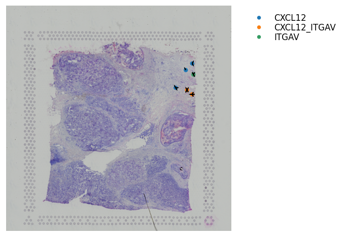
Adding Arrows to show the Direction of Interaction
This is only useful when zooming in and want to display cell information and direction of interaction at the same time.
[25]:
st.pl.lr_plot(block1, best_lr,
              inner_size_prop=0.08, middle_size_prop=.3, outer_size_prop=.5,
              outer_mode='binary', pt_scale=50,
              show_image=True, arrow_width=10, arrow_head_width=10,
              sig_spots=True, show_arrows=True,
              bbox_to_anchor=(1.5, 1))
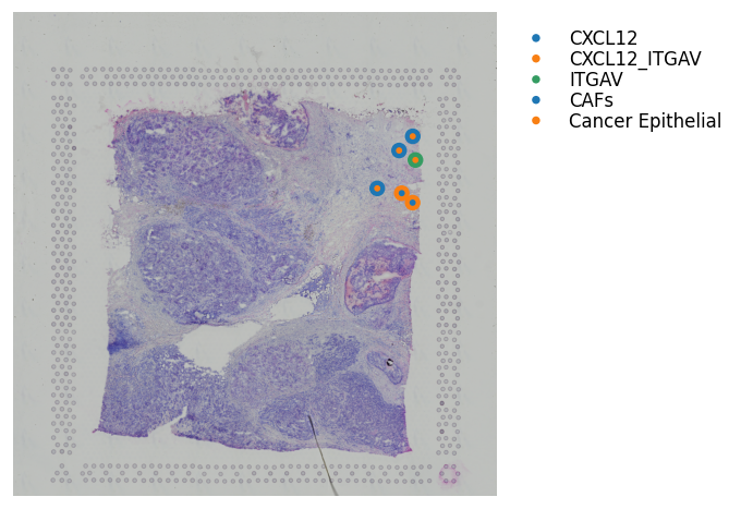
Binary LR coexpression with Spot Annotations
We can also visualise where the ligand or receptor are expressed/coexpressed simultaneously with the dominant spot cell type.
The outter spot shows the expression of ligand (red), the receptor (green), and coexpression (blue). The inner spot is coloured by the dominant spot cell type.
[26]:
st.pl.lr_plot(block1, best_lr,
              inner_size_prop=0.08, middle_size_prop=.3, outer_size_prop=.5,
              outer_mode='binary', pt_scale=150,
              use_label='cell_type', show_image=True,
              sig_spots=True,
              bbox_to_anchor=(1.5, 1))
Predicting significant CCIs
With the establishment of significant areas of LR interaction, can now determine the significantly interacting cell types.
[27]:
# Running the counting of co-occurence of cell types and LR expression hotspots #
st.tl.cci.run_cci(block1, 'cell_type',  # Spot cell information either in data.obs or data.uns
                  min_spots=3,  # Minimum number of spots for LR to be tested.
                  spot_mixtures=True,  # If True will use the label transfer scores,
                  # so spots can have multiple cell types if score>cell_prop_cutoff
                  cell_prop_cutoff=0.2,  # Spot considered to have cell type if score>0.2
                  sig_spots=True,  # Only consider neighbourhoods of spots which had significant LR scores.
                  n_perms=50,  # Permutations of cell information to get background, recommend at least ~1000
                  n_cpus=n_cpus, # Maximum CPU.
                  random_state=seed
                  )
Getting cached neighbourhood information...
Getting information for CCI counting...
Counting celltype-celltype interactions per LR and permuting 50 times.: 100%|██████████████████████████████████████████████████████████████████████████████████████████████████████████████████ [ time left: 00:00 ]
Significant counts of cci_rank interactions for all LR pairs in data.uns[lr_cci_cell_type]
Significant counts of cci_rank interactions for each LR pair stored in dictionary data.uns[per_lr_cci_cell_type]
Diagnostic plot: check interaction and cell type frequency correlation
The plot below should show little to no correlation if the number of permutations is adequate; otherwise recommend increasing n_perms above.
[28]:
st.pl.cci_check(block1, 'cell_type')
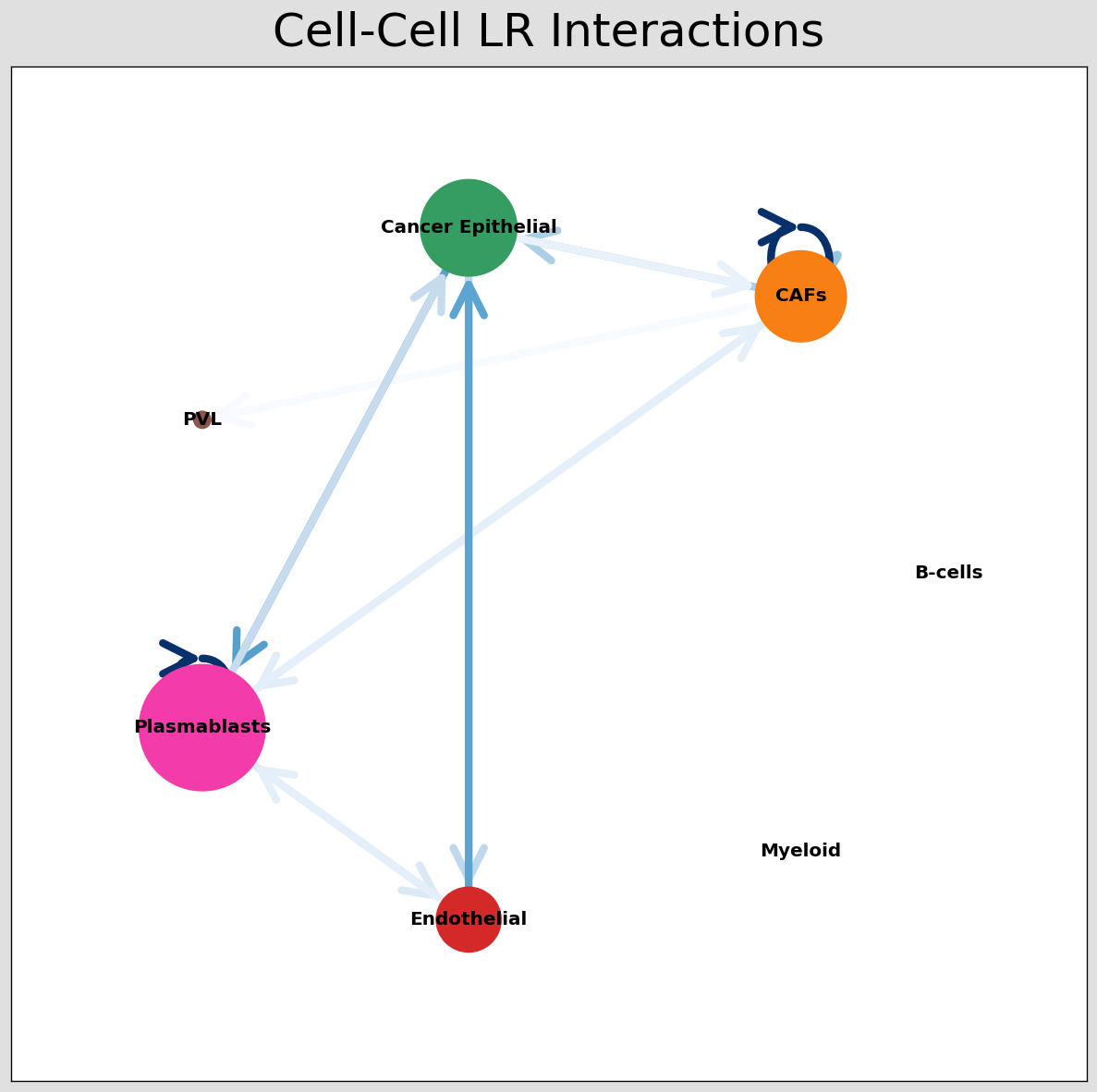
CCI Visualisations
With the celltype-celltype predictions completed, we implement a number of visualisations to explore the interaction landscape across LR pairs or for each independent pair.
CCI network
The below shows the stlearn version of a CCI network.
If you’re more comfortable with visualisations in R, it’s possible to save the adjacency matrix that generates this network from the anndata object and use visualisation functions from CellChat to make R-based visualisations.
[29]:
# Visualising the no. of interactions between cell types across all LR pairs #
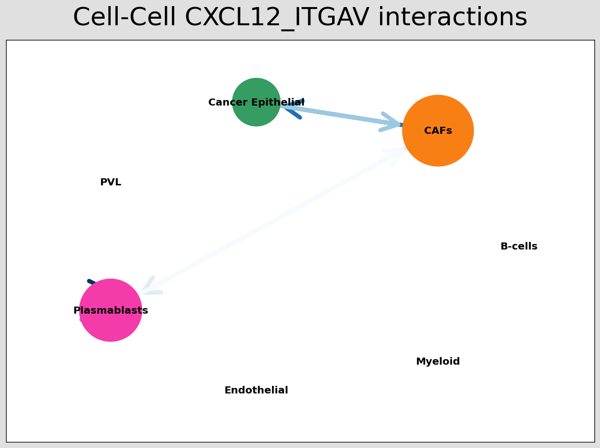
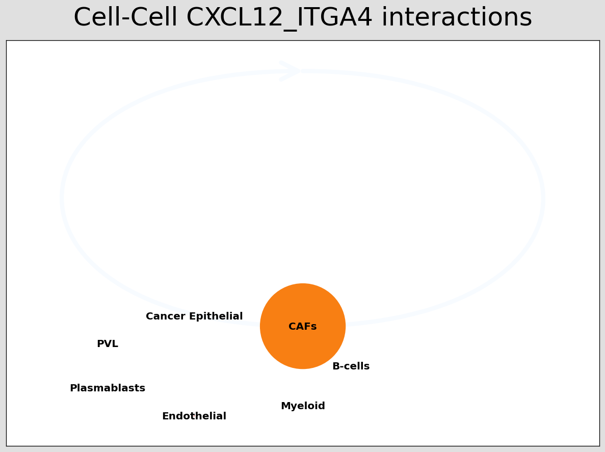
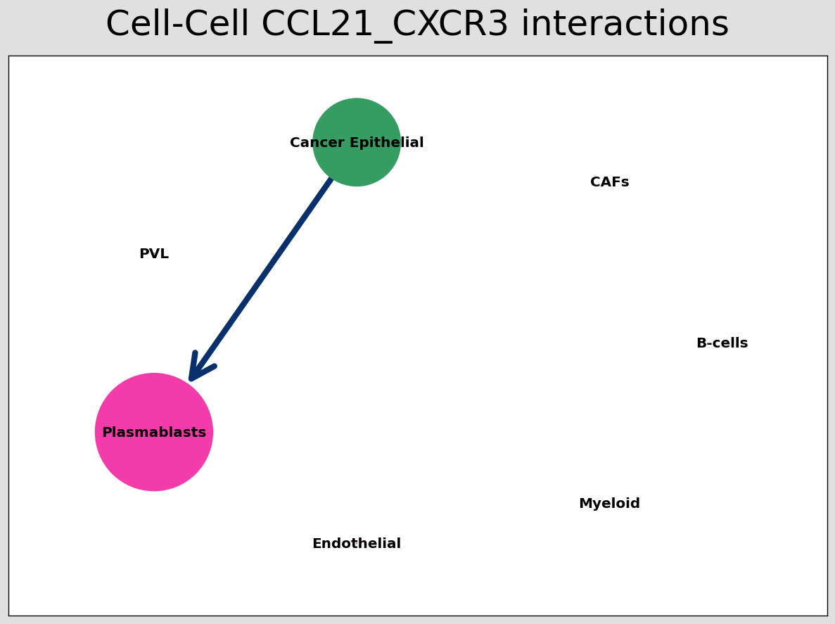
pos_1 = st.pl.ccinet_plot(block1, 'cell_type', return_pos=True)
# Just examining the cell type interactions between selected pairs #
lrs = block1.uns['lr_summary'].index.values[0:3]
for best_lr in lrs[0:3]:
st.pl.ccinet_plot(block1, 'cell_type', best_lr, min_counts=2,
figsize=(10, 7.5), pos=pos_1,
)
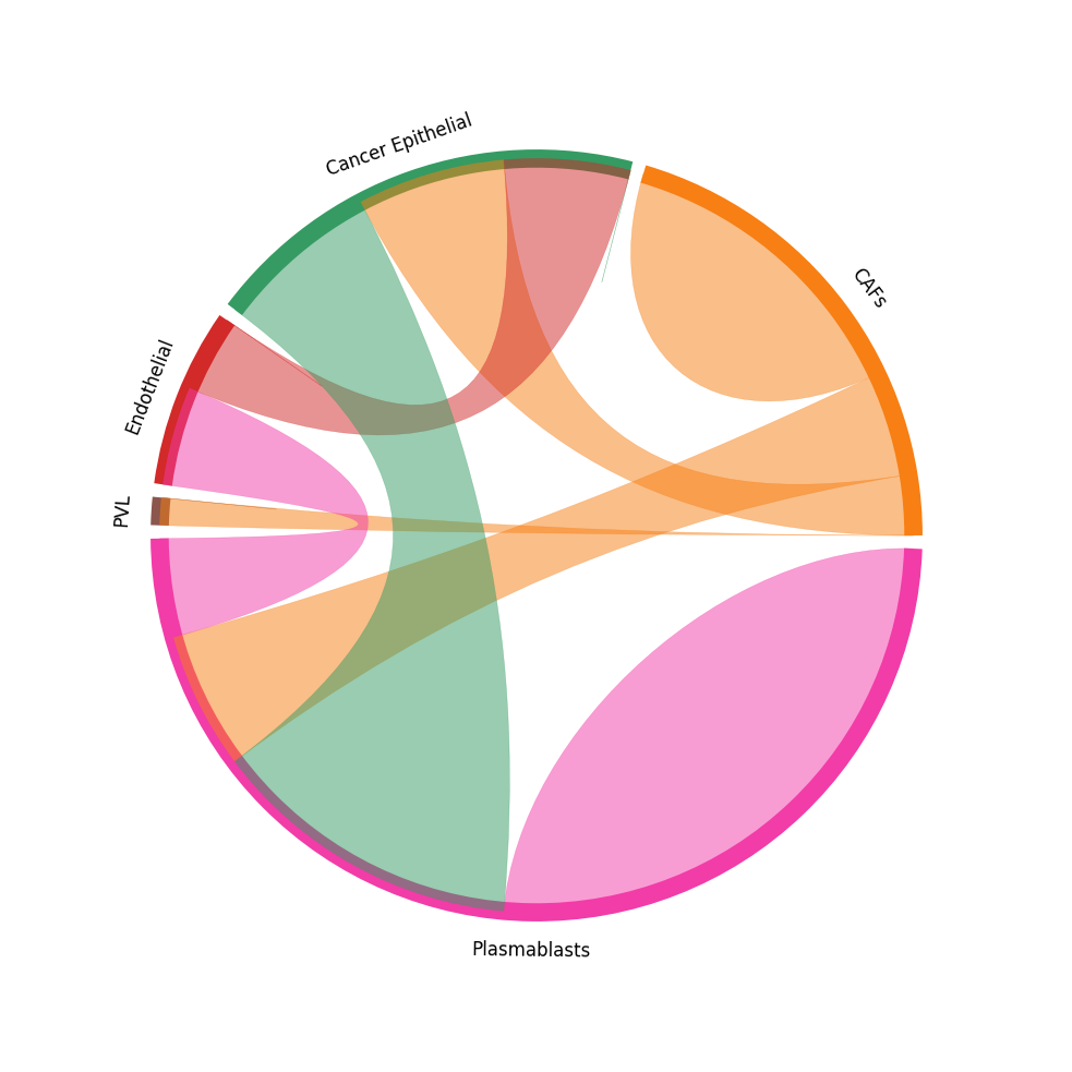
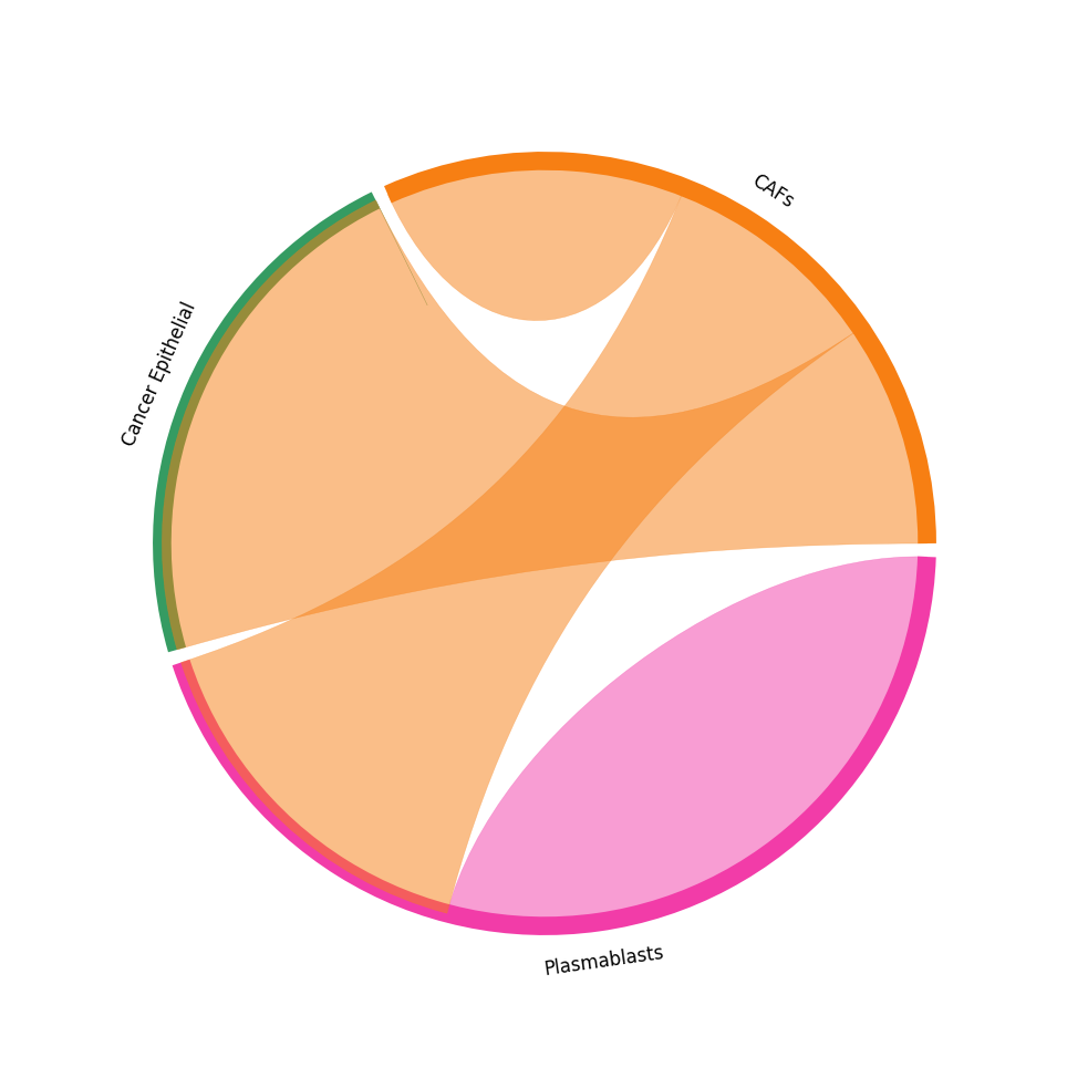
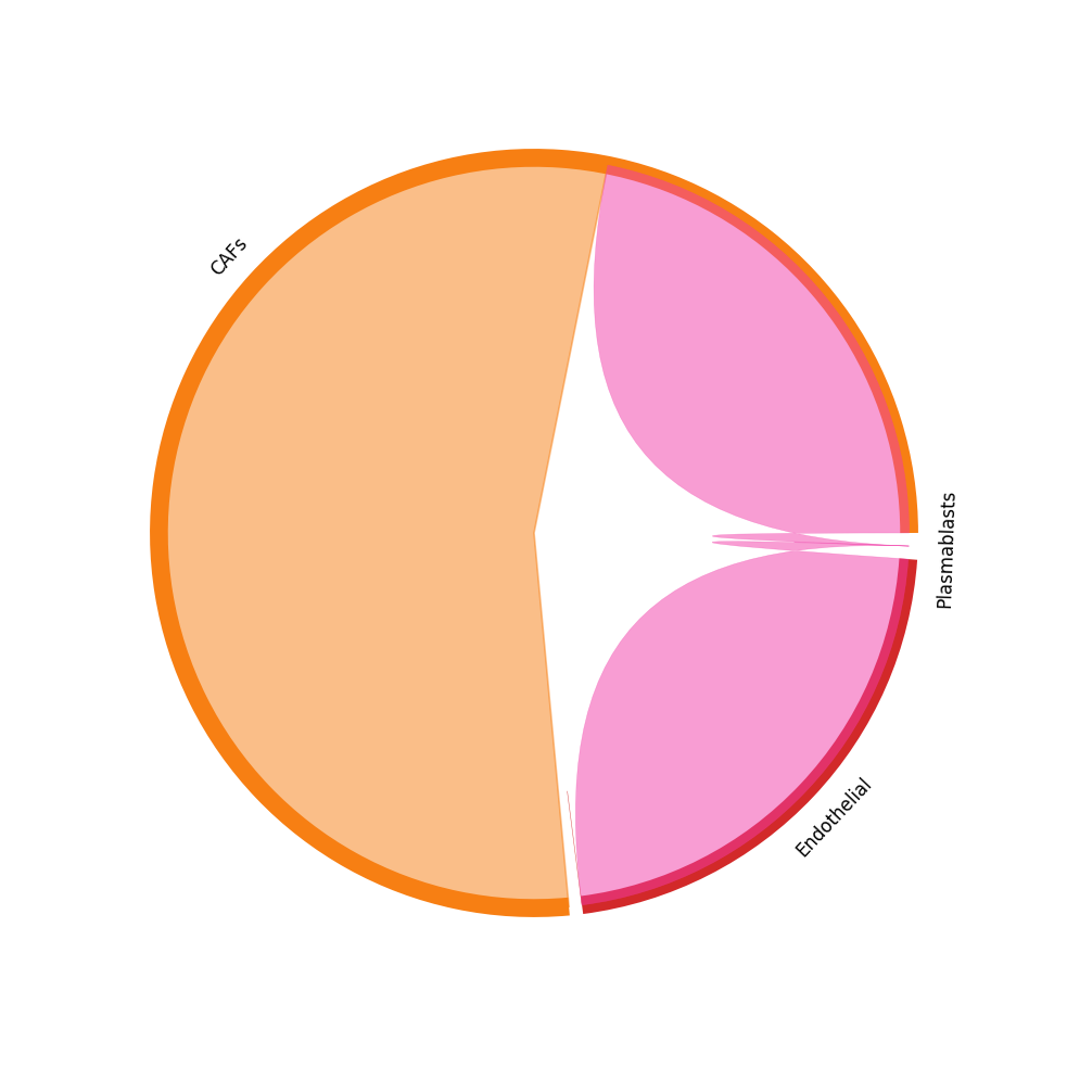
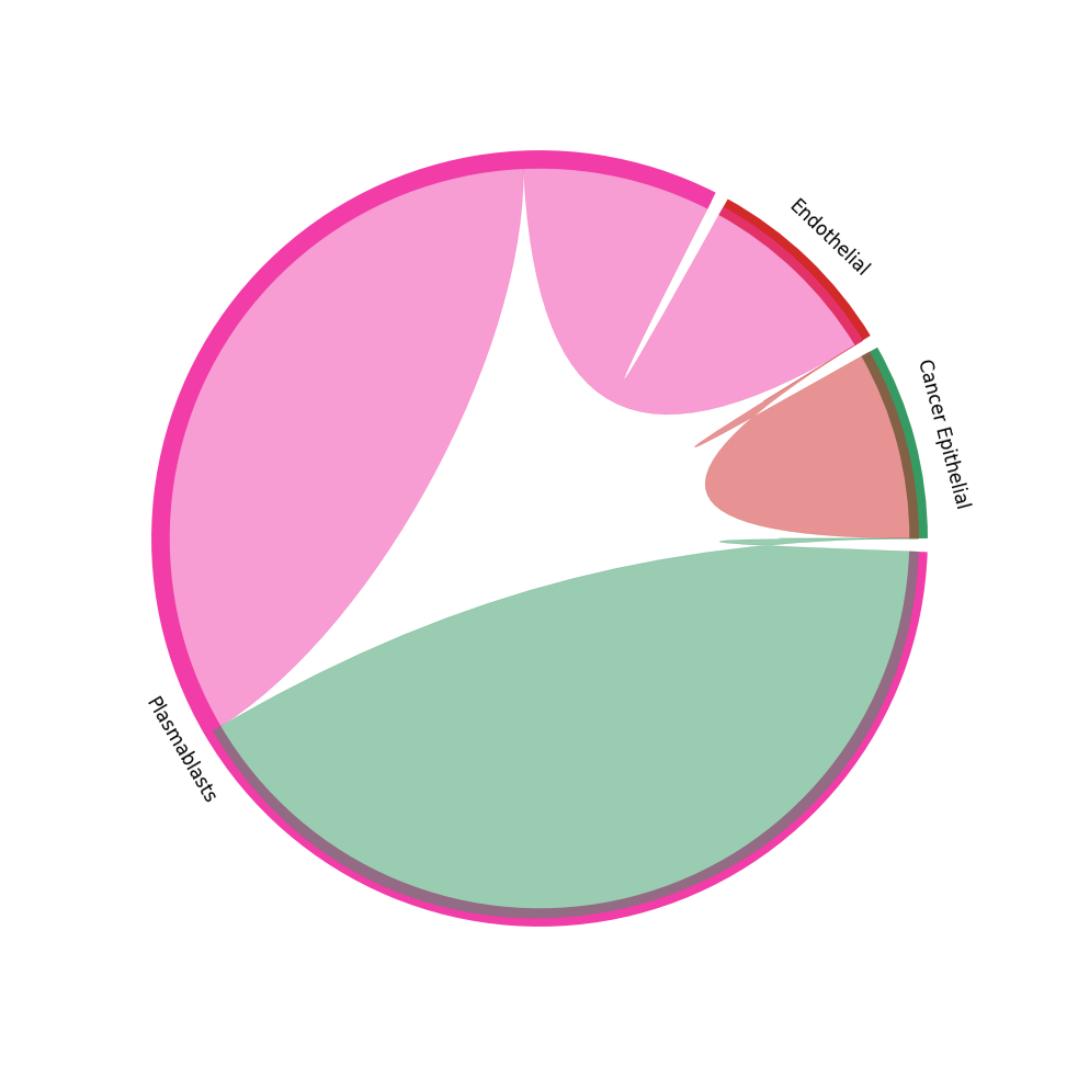
CCI chord-plot
The chord-plot is really useful when visualising interactions between few cell types
[30]:
st.pl.lr_chord_plot(block1, 'cell_type')

for lr in lrs:
    st.pl.lr_chord_plot(block1, 'cell_type', lr)
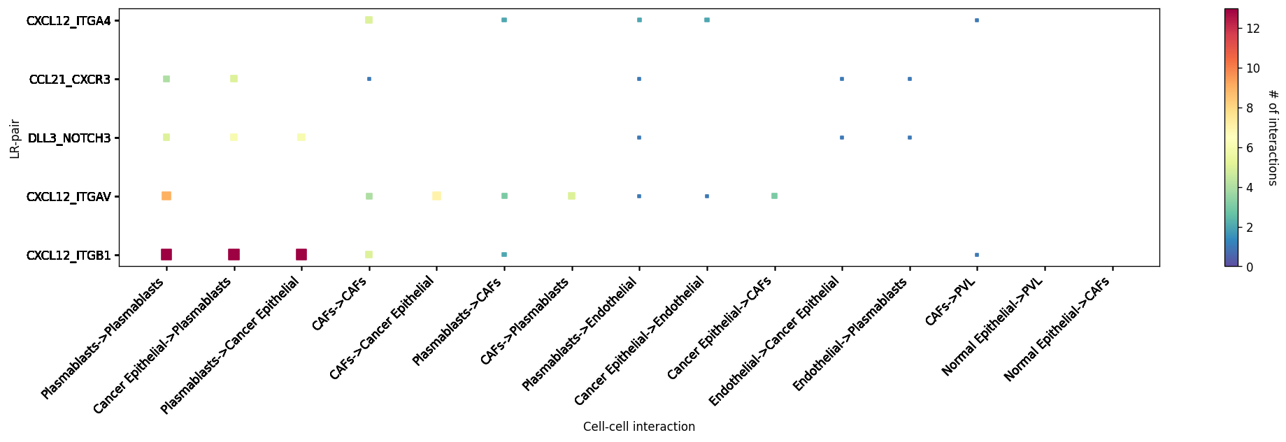
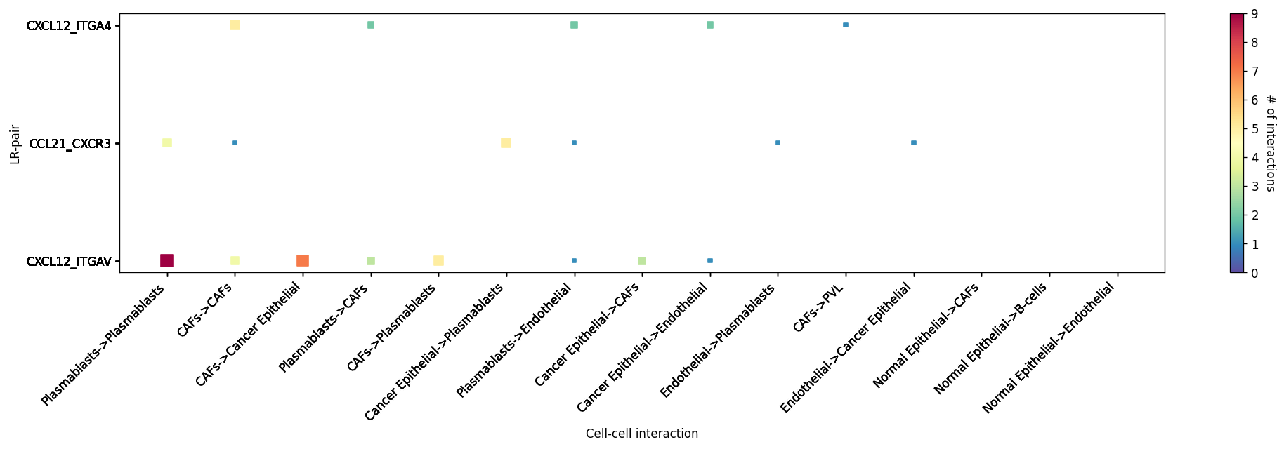
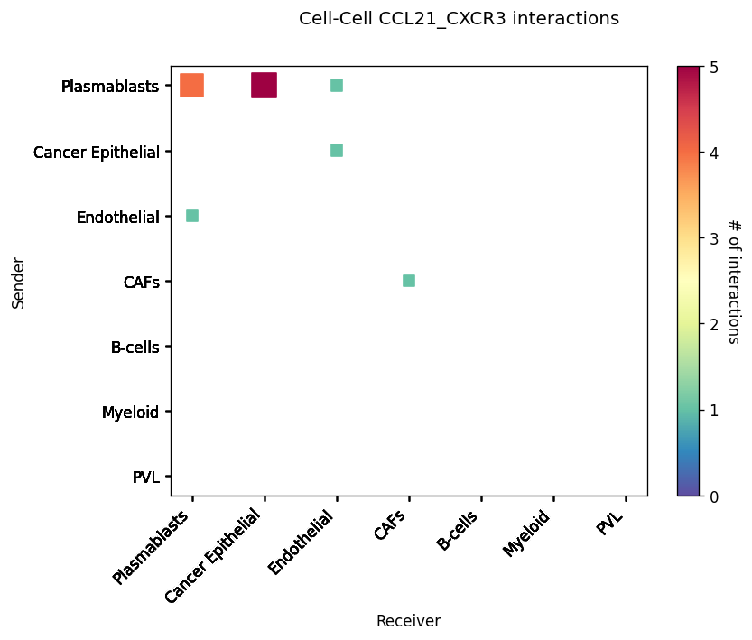
Heatmap Visualisations
LR-CCI-Map
We also impliment a number of heatmap visualisations so you can visualise individual celltype-celltype interactions across multiple LR pairs concurrently.
[31]:
# This will automatically select the top interacting CCIs and their respective LRs #
st.pl.lr_cci_map(block1, 'cell_type', lrs=None, min_total=100, figsize=(20, 4))
[31]:
<Axes: xlabel='Cell-cell interaction', ylabel='LR-pair'>
[32]:
# You can also put in your own LR pairs of interest #
st.pl.lr_cci_map(block1, 'cell_type', lrs=lrs, min_total=100, figsize=(20, 4))
[32]:
<Axes: xlabel='Cell-cell interaction', ylabel='LR-pair'>
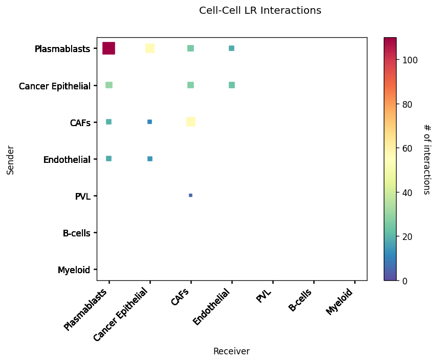
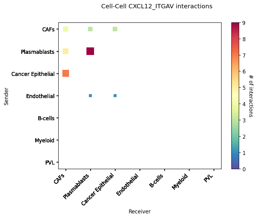
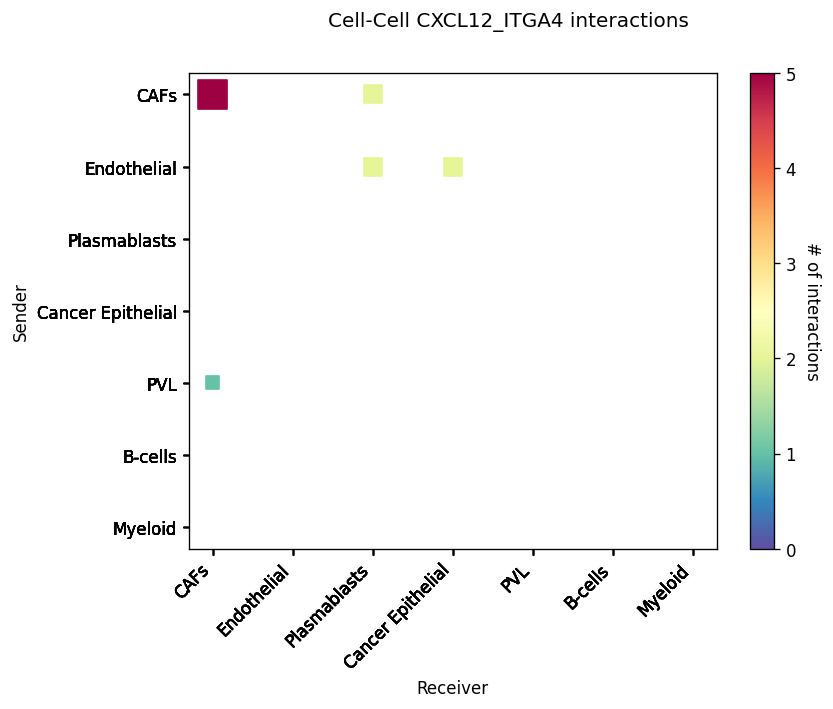
CCI Maps
This is a heatmap equivalent to the network diagrams and chordplots, it has more quantitative benefits.
The # of interactions refers to the number of times a spot with the reciever cell type expressed the ligand and the source cell type expressed the receptor in the same neighbourhood.
[33]:
st.pl.cci_map(block1, 'cell_type')

lrs = block1.uns['lr_summary'].index.values[0:3]
for lr in lrs[0:3]:
    st.pl.cci_map(block1, 'cell_type', lr)
Spatial cell type interactions
By combining the spatial LR analysis with the significant CCI from the CCI analysis, we can now visualise where in the tissue these cell types are interacting.
The recommended method for this is to plot the cell types, and overlay arrows indicating spots that express the ligand and spots that express the receptor.
This way can see - at spot level in the spatial context - where the different cell types interact and via a given ligand-receptor pair.
NOTE: the will need to be zoom-in to be visualised properly, very useful for showing particular regions of interest.
[34]:
best_lr = lrs[0]

### This will plot with simple black arrows ####
st.pl.lr_plot(block1, best_lr, outer_size_prop=1, outer_mode=None,
              pt_scale=40, use_label='cell_type', show_arrows=True,
              show_image=True, sig_spots=False, sig_cci=True,
              arrow_head_width=4,
              arrow_width=1, cell_alpha=.8,
              bbox_to_anchor=(1.5, 1)
              )

### This will colour the spot by the mean LR expression in the spots connected by arrow
st.pl.lr_plot(block1, best_lr, outer_size_prop=1, outer_mode=None,
              pt_scale=10, use_label='cell_type', show_arrows=True,
              show_image=True, sig_spots=False, sig_cci=True,
              arrow_head_width=4, arrow_width=2,
              arrow_cmap='YlOrRd', arrow_vmax=1.5,
              bbox_to_anchor=(1.5, 1)
              )

Visualisation Tips
CCIs in the spatial context are very high-dimensional and information rich. Which of the above visualisation will be useful will depend on the biology and key aspect you wish to highlight.
In our experience, it’s useful to show the LR statistics for LRs of interest, and then plot with the cell type information and the arrows.
In the latter plot, it’s best to highlight regions of interest (like the arrows above) which are then shown zoomed-in. Thus allowing you to highlight representative areas where interesting CCIs are predicted to occur.
See the ‘Interactive stLearn’ tutorial to create such visualisations easily and rapidly using interactive bokeh apps.
Tutorial by Brad Balderson