Core Plotting Functions
Here we want to introduce several visualization functions in stLearn.
Source: https://www.10xgenomics.com/datasets/human-breast-cancer-block-a-section-1-1-standard-1-1-0
Loading processed data
[1]:
import os
import platform

# Only constrain threads on macOS where BLAS/numba deadlocks are common.
# Must run before any numpy/scanpy import.
if platform.system() == "Darwin":
    os.environ["OPENBLAS_NUM_THREADS"] = "1"
    os.environ["MKL_NUM_THREADS"] = "1"
    os.environ["NUMBA_NUM_THREADS"] = "1"
    n_cpus = 1
else:
    n_cpus = None
[2]:
import stlearn as st
import pathlib as pathlib
import numpy as np
import random as random
import os as os

st.settings.set_figure_params(dpi=120)

seed = 0
np.random.seed(seed)
random.seed(seed)
os.environ['PYTHONHASHSEED'] = str(seed)

# Ignore all warnings
import warnings

warnings.filterwarnings("ignore")
[3]:
sample_id = "V1_Breast_Cancer_Block_A_Section_1"
[4]:
# Setup directory structure
project_root = pathlib.Path.cwd().parent
st.settings.datasetdir = project_root / "data"
annotation_path = project_root / "annotations"
cell_types_path = annotation_path / f"{sample_id}_cell_type_proportions.csv"
lr_summary_path = annotation_path / f"{sample_id}_lr_summary.csv"
lr_features_path = annotation_path / f"{sample_id}_lr_features.csv"
lr_data_path = annotation_path / f"{sample_id}_lr_data.h5ad"
[5]:
# Read raw data
adata = st.datasets.visium_sge(sample_id=sample_id)
adata = st.convert_scanpy(adata)
[6]:
# Adding the previous label transfer results
st.adds.row_annotations.row_annotations(adata, cell_types_path, "id")
cell_type_cols = ['Endothelial', 'CAFs', 'PVL', 'B-cells', 'T-cells', 'Myeloid', 'Normal Epithelial', 'Plasmablasts', 'Cancer Epithelial']
labels = adata.obs[cell_type_cols].idxmax(axis=1)
adata.obs['cell_type'] = labels
adata
[6]:
AnnData object with n_obs × n_vars = 3798 × 36601
    obs: 'in_tissue', 'array_row', 'array_col', 'imagecol', 'imagerow', 'Endothelial', 'CAFs', 'PVL', 'B-cells', 'T-cells', 'Myeloid', 'Normal Epithelial', 'Plasmablasts', 'Cancer Epithelial', 'cell_type'
    var: 'gene_ids', 'feature_types', 'genome'
    uns: 'spatial'
    obsm: 'spatial'
[7]:
# Columns for LR summary/features
lr_uns_columns = ['lr_summary', 'lrfeatures', 'per_lr_cci_cell_type', 'per_lr_cci_pvals_cell_type', 'per_lr_cci_raw_cell_type']
lr_obsm_columns = ["lr_scores", "p_vals", "p_adjs", "-log10(p_adjs)", "lr_sig_scores", "spot_neighbours"]
[8]:
adata_processed = adata.copy()
st.pp.filter_genes(adata_processed, min_cells=3)
st.pp.normalize_total(adata_processed)
st.pp.log1p(adata_processed)
Normalization step is finished in adata.X
Log transformation step is finished in adata.X
[9]:
st.em.run_pca(adata_processed, n_comps=50, random_state=0)
st.pp.neighbors(adata_processed, n_neighbors=25, use_rep='X_pca', random_state=0)
st.tl.clustering.leiden(adata_processed, resolution=1.15, random_state=0)
PCA is done! Generated in adata.obsm['X_pca'], adata.uns['pca'] and adata.varm['PCs']
Created k-Nearest-Neighbor graph in adata.uns['neighbors']
Applying Leiden cluster ...
Leiden cluster is done! The labels are stored in adata.obs['leiden']
[10]:
# Merge previous calculate LR run.
adata_processed = st.tl.cache.merge_h5ad_into_adata(adata_processed, lr_data_path)
Reading /Volumes/Data/work/stLearn-tutorials/annotations/V1_Breast_Cancer_Block_A_Section_1_lr_data.h5ad
Added obsm['-log10(p_adjs)'] with shape (3798, 1753)
Added obsm['lr_scores'] with shape (3798, 1753)
Added obsm['lr_sig_scores'] with shape (3798, 1753)
Added obsm['p_adjs'] with shape (3798, 1753)
Added obsm['p_vals'] with shape (3798, 1753)
Added obsm['spot_neighbours'] with shape (3798, 1)
Added uns['lr_summary']
Added uns['lrfeatures']
Added uns['per_lr_cci_cell_type']
Added uns['per_lr_cci_pvals_cell_type']
Added uns['per_lr_cci_raw_cell_type']
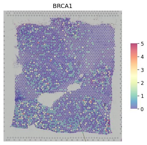
Gene plot
Here is the standard plot for gene expression, we provide 2 options for single genes and multiple genes:
[11]:
st.pl.gene_plot(adata, gene_symbols="BRCA1")
[11]:
AnnData object with n_obs × n_vars = 3798 × 36601
    obs: 'in_tissue', 'array_row', 'array_col', 'imagecol', 'imagerow', 'Endothelial', 'CAFs', 'PVL', 'B-cells', 'T-cells', 'Myeloid', 'Normal Epithelial', 'Plasmablasts', 'Cancer Epithelial', 'cell_type'
    var: 'gene_ids', 'feature_types', 'genome'
    uns: 'spatial'
    obsm: 'spatial'
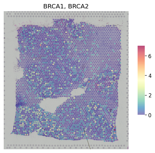
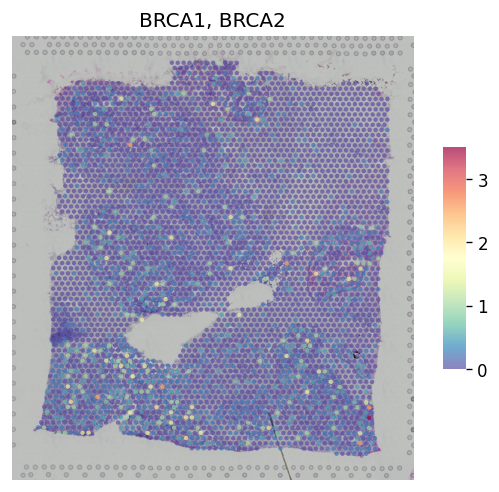
For multiple genes, you can combine multiple genes by 'CumSum'cummulative sum or 'NaiveMean'naive mean:
[12]:
st.pl.gene_plot(adata, gene_symbols=["BRCA1", "BRCA2"], method="CumSum")
[12]:
AnnData object with n_obs × n_vars = 3798 × 36601
    obs: 'in_tissue', 'array_row', 'array_col', 'imagecol', 'imagerow', 'Endothelial', 'CAFs', 'PVL', 'B-cells', 'T-cells', 'Myeloid', 'Normal Epithelial', 'Plasmablasts', 'Cancer Epithelial', 'cell_type'
    var: 'gene_ids', 'feature_types', 'genome'
    uns: 'spatial'
    obsm: 'spatial'
[13]:
st.pl.gene_plot(adata, gene_symbols=["BRCA1", "BRCA2"], method="NaiveMean")
[13]:
AnnData object with n_obs × n_vars = 3798 × 36601
    obs: 'in_tissue', 'array_row', 'array_col', 'imagecol', 'imagerow', 'Endothelial', 'CAFs', 'PVL', 'B-cells', 'T-cells', 'Myeloid', 'Normal Epithelial', 'Plasmablasts', 'Cancer Epithelial', 'cell_type'
    var: 'gene_ids', 'feature_types', 'genome'
    uns: 'spatial'
    obsm: 'spatial'
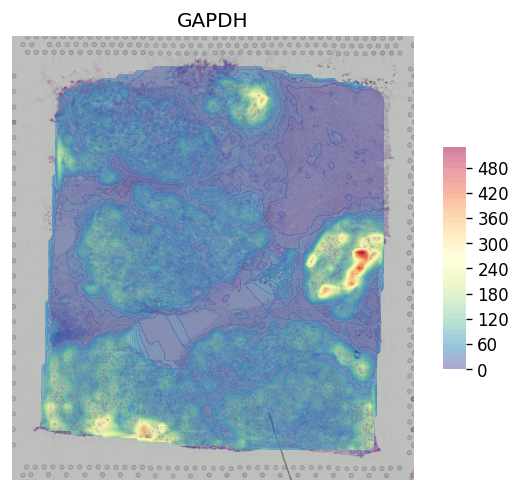
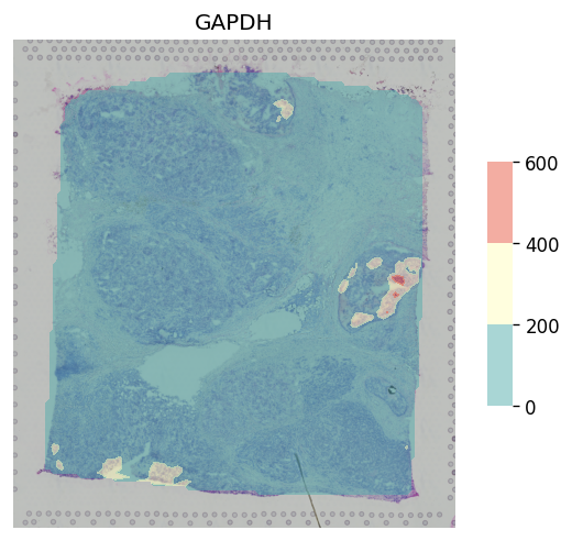
You also can plot genes with contour plot to see clearer about the distribution of genes:
[14]:
st.pl.gene_plot(adata, gene_symbols="GAPDH", contour=True, cell_alpha=0.5)
[14]:
AnnData object with n_obs × n_vars = 3798 × 36601
    obs: 'in_tissue', 'array_row', 'array_col', 'imagecol', 'imagerow', 'Endothelial', 'CAFs', 'PVL', 'B-cells', 'T-cells', 'Myeloid', 'Normal Epithelial', 'Plasmablasts', 'Cancer Epithelial', 'cell_type'
    var: 'gene_ids', 'feature_types', 'genome'
    uns: 'spatial'
    obsm: 'spatial'
You can change the step_size to cut the range of display in contour
[15]:
st.pl.gene_plot(adata, gene_symbols="GAPDH", contour=True, cell_alpha=0.5, step_size=200)
[15]:
AnnData object with n_obs × n_vars = 3798 × 36601
    obs: 'in_tissue', 'array_row', 'array_col', 'imagecol', 'imagerow', 'Endothelial', 'CAFs', 'PVL', 'B-cells', 'T-cells', 'Myeloid', 'Normal Epithelial', 'Plasmablasts', 'Cancer Epithelial', 'cell_type'
    var: 'gene_ids', 'feature_types', 'genome'
    uns: 'spatial'
    obsm: 'spatial'
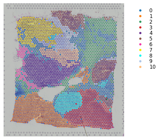
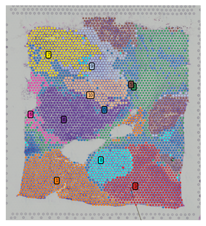
Cluster plot
We provide different options for display clustering results. Several show_* options that user can control to display different parts of the figure:
[16]:
st.pl.cluster_plot(adata_processed, use_label="leiden", bbox_to_anchor=(1.3, 1))
[16]:
AnnData object with n_obs × n_vars = 3798 × 22240
    obs: 'in_tissue', 'array_row', 'array_col', 'imagecol', 'imagerow', 'Endothelial', 'CAFs', 'PVL', 'B-cells', 'T-cells', 'Myeloid', 'Normal Epithelial', 'Plasmablasts', 'Cancer Epithelial', 'cell_type', 'leiden'
    var: 'gene_ids', 'feature_types', 'genome', 'n_cells'
    uns: 'spatial', 'log1p', 'pca', 'neighbors', 'leiden', 'lr_summary', 'lrfeatures', 'per_lr_cci_cell_type', 'per_lr_cci_pvals_cell_type', 'per_lr_cci_raw_cell_type', 'leiden_colors'
    obsm: 'spatial', 'X_pca', '-log10(p_adjs)', 'lr_scores', 'lr_sig_scores', 'p_adjs', 'p_vals', 'spot_neighbours'
    varm: 'PCs'
    obsp: 'distances', 'connectivities'
[17]:
st.pl.cluster_plot(adata_processed, use_label="leiden", show_cluster_labels=True, show_color_bar=False)
[17]:
AnnData object with n_obs × n_vars = 3798 × 22240
    obs: 'in_tissue', 'array_row', 'array_col', 'imagecol', 'imagerow', 'Endothelial', 'CAFs', 'PVL', 'B-cells', 'T-cells', 'Myeloid', 'Normal Epithelial', 'Plasmablasts', 'Cancer Epithelial', 'cell_type', 'leiden'
    var: 'gene_ids', 'feature_types', 'genome', 'n_cells'
    uns: 'spatial', 'log1p', 'pca', 'neighbors', 'leiden', 'lr_summary', 'lrfeatures', 'per_lr_cci_cell_type', 'per_lr_cci_pvals_cell_type', 'per_lr_cci_raw_cell_type', 'leiden_colors'
    obsm: 'spatial', 'X_pca', '-log10(p_adjs)', 'lr_scores', 'lr_sig_scores', 'p_adjs', 'p_vals', 'spot_neighbours'
    varm: 'PCs'
    obsp: 'distances', 'connectivities'
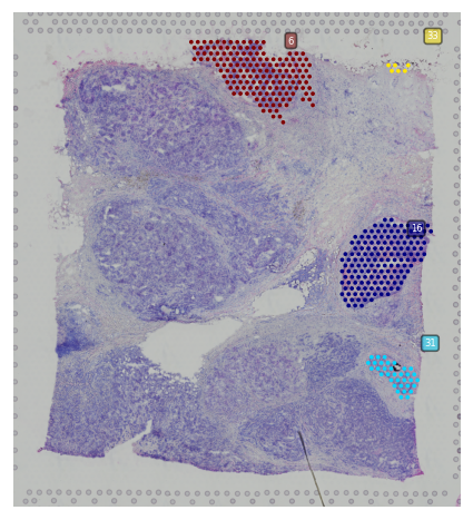
Subcluster plot
We also provide option to plot spatial subclusters based on the spatial location within a cluster.
You have two options here, display subclusters for multiple clusters using show_subcluster in st.pl.cluster_plot or use st.pl.subcluster_plot to display subclusters within a cluster but with different color.
[18]:
# Generate subclusters with a distance of 50
st.spatial.clustering.localization(adata_processed, eps=50)
[19]:
st.pl.cluster_plot(adata_processed, use_label="leiden", show_subcluster=True, show_color_bar=False,
                   list_clusters=["5", "8"])
[19]:
AnnData object with n_obs × n_vars = 3798 × 22240
    obs: 'in_tissue', 'array_row', 'array_col', 'imagecol', 'imagerow', 'Endothelial', 'CAFs', 'PVL', 'B-cells', 'T-cells', 'Myeloid', 'Normal Epithelial', 'Plasmablasts', 'Cancer Epithelial', 'cell_type', 'leiden', 'sub_cluster_labels'
    var: 'gene_ids', 'feature_types', 'genome', 'n_cells'
    uns: 'spatial', 'log1p', 'pca', 'neighbors', 'leiden', 'lr_summary', 'lrfeatures', 'per_lr_cci_cell_type', 'per_lr_cci_pvals_cell_type', 'per_lr_cci_raw_cell_type', 'leiden_colors', 'leiden_index_dict'
    obsm: 'spatial', 'X_pca', '-log10(p_adjs)', 'lr_scores', 'lr_sig_scores', 'p_adjs', 'p_vals', 'spot_neighbours'
    varm: 'PCs'
    obsp: 'distances', 'connectivities'
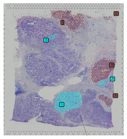
[20]:
st.pl.subcluster_plot(adata_processed, use_label="leiden", cluster="5")
[20]:
AnnData object with n_obs × n_vars = 3798 × 22240
    obs: 'in_tissue', 'array_row', 'array_col', 'imagecol', 'imagerow', 'Endothelial', 'CAFs', 'PVL', 'B-cells', 'T-cells', 'Myeloid', 'Normal Epithelial', 'Plasmablasts', 'Cancer Epithelial', 'cell_type', 'leiden', 'sub_cluster_labels'
    var: 'gene_ids', 'feature_types', 'genome', 'n_cells'
    uns: 'spatial', 'log1p', 'pca', 'neighbors', 'leiden', 'lr_summary', 'lrfeatures', 'per_lr_cci_cell_type', 'per_lr_cci_pvals_cell_type', 'per_lr_cci_raw_cell_type', 'leiden_colors', 'leiden_index_dict'
    obsm: 'spatial', 'X_pca', '-log10(p_adjs)', 'lr_scores', 'lr_sig_scores', 'p_adjs', 'p_vals', 'spot_neighbours'
    varm: 'PCs'
    obsp: 'distances', 'connectivities'
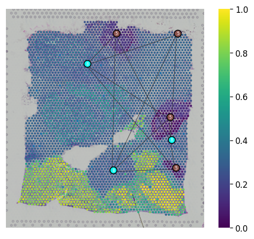
Spatial trajectory plot
We provided st.pl.trajectory.pseudotime_plot to visualize PAGA graph that maps into spatial transcriptomics array.
[21]:
adata_processed.raw = adata
adata_processed.uns["iroot"] = st.spatial.trajectory.set_root(adata_processed, use_label="leiden", cluster="5",
                                                              use_raw=True)
st.spatial.trajectory.pseudotime(adata_processed, eps=50, n_neighbors=30, use_rep="X_pca", use_label="leiden")
All available trajectory paths are stored in adata.uns['available_paths'] with length < 4 nodes
[22]:
st.pl.trajectory.pseudotime_plot(adata_processed, use_label="leiden", pseudotime_key="dpt_pseudotime",
                                 list_clusters=["5", "8"], show_node=True)
[22]:
AnnData object with n_obs × n_vars = 3798 × 22240
    obs: 'in_tissue', 'array_row', 'array_col', 'imagecol', 'imagerow', 'Endothelial', 'CAFs', 'PVL', 'B-cells', 'T-cells', 'Myeloid', 'Normal Epithelial', 'Plasmablasts', 'Cancer Epithelial', 'cell_type', 'leiden', 'sub_cluster_labels', 'dpt_pseudotime'
    var: 'gene_ids', 'feature_types', 'genome', 'n_cells'
    uns: 'spatial', 'log1p', 'pca', 'neighbors', 'leiden', 'lr_summary', 'lrfeatures', 'per_lr_cci_cell_type', 'per_lr_cci_pvals_cell_type', 'per_lr_cci_raw_cell_type', 'leiden_colors', 'leiden_index_dict', 'iroot', 'paga', 'leiden_sizes', 'diffmap_evals', 'threshold_spots', 'split_node', 'global_graph', 'centroid_dict', 'available_paths'
    obsm: 'spatial', 'X_pca', '-log10(p_adjs)', 'lr_scores', 'lr_sig_scores', 'p_adjs', 'p_vals', 'spot_neighbours', 'X_diffmap'
    varm: 'PCs'
    obsp: 'distances', 'connectivities'
[23]:
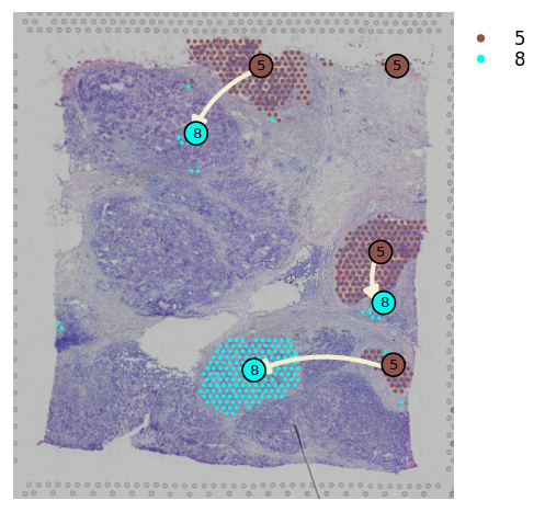
st.spatial.trajectory.pseudotimespace_global(adata_processed, use_label="leiden", list_clusters=["5", "8"])
Start to construct the trajectory: 5 -> 8
[23]:
AnnData object with n_obs × n_vars = 3798 × 22240
    obs: 'in_tissue', 'array_row', 'array_col', 'imagecol', 'imagerow', 'Endothelial', 'CAFs', 'PVL', 'B-cells', 'T-cells', 'Myeloid', 'Normal Epithelial', 'Plasmablasts', 'Cancer Epithelial', 'cell_type', 'leiden', 'sub_cluster_labels', 'dpt_pseudotime'
    var: 'gene_ids', 'feature_types', 'genome', 'n_cells'
    uns: 'spatial', 'log1p', 'pca', 'neighbors', 'leiden', 'lr_summary', 'lrfeatures', 'per_lr_cci_cell_type', 'per_lr_cci_pvals_cell_type', 'per_lr_cci_raw_cell_type', 'leiden_colors', 'leiden_index_dict', 'iroot', 'paga', 'leiden_sizes', 'diffmap_evals', 'threshold_spots', 'split_node', 'global_graph', 'centroid_dict', 'available_paths', 'PTS_graph'
    obsm: 'spatial', 'X_pca', '-log10(p_adjs)', 'lr_scores', 'lr_sig_scores', 'p_adjs', 'p_vals', 'spot_neighbours', 'X_diffmap'
    varm: 'PCs'
    obsp: 'distances', 'connectivities'
You can plot spatial trajectory analysis results with the node in each subcluster by show_trajectories and show_node parameters.
[24]:
st.pl.cluster_plot(adata_processed, use_label="leiden", show_trajectories=True, show_color_bar=True,
                   list_clusters=["5", "8"], show_node=True, bbox_to_anchor=(1.2, 1))
[24]:
AnnData object with n_obs × n_vars = 3798 × 22240
    obs: 'in_tissue', 'array_row', 'array_col', 'imagecol', 'imagerow', 'Endothelial', 'CAFs', 'PVL', 'B-cells', 'T-cells', 'Myeloid', 'Normal Epithelial', 'Plasmablasts', 'Cancer Epithelial', 'cell_type', 'leiden', 'sub_cluster_labels', 'dpt_pseudotime'
    var: 'gene_ids', 'feature_types', 'genome', 'n_cells'
    uns: 'spatial', 'log1p', 'pca', 'neighbors', 'leiden', 'lr_summary', 'lrfeatures', 'per_lr_cci_cell_type', 'per_lr_cci_pvals_cell_type', 'per_lr_cci_raw_cell_type', 'leiden_colors', 'leiden_index_dict', 'iroot', 'paga', 'leiden_sizes', 'diffmap_evals', 'threshold_spots', 'split_node', 'global_graph', 'centroid_dict', 'available_paths', 'PTS_graph'
    obsm: 'spatial', 'X_pca', '-log10(p_adjs)', 'lr_scores', 'lr_sig_scores', 'p_adjs', 'p_vals', 'spot_neighbours', 'X_diffmap'
    varm: 'PCs'
    obsp: 'distances', 'connectivities'
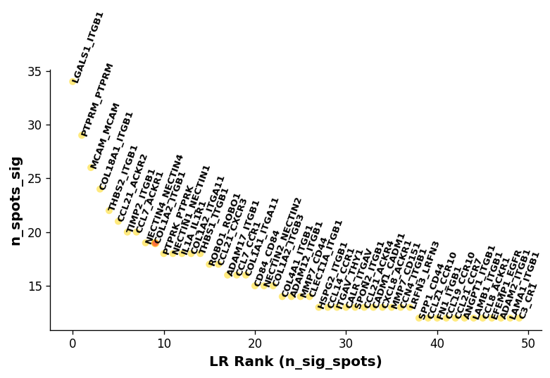
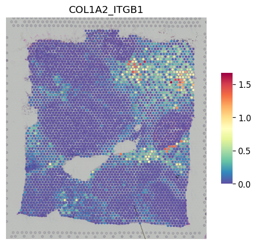
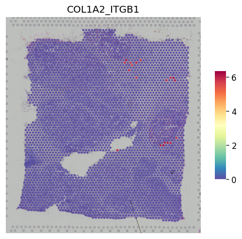
Ligand-receptor interaction plots
For the stLearn ligand-receptor cell-cell interaction analysis, you can display basic results for LRs using st.pl.lr_result_plot. For many more visualisations, please see the stLearn Cell-cell interaction analysis tutorial.
[25]:
lr_pair_of_interest = 'COL1A2_ITGB1'
[26]:
lrs = st.tl.cci.load_lrs(['connectomeDB2020_lit'], species='human')
lrs
[26]:
array(['A2M_LRP1', 'AANAT_MTNR1A', 'AANAT_MTNR1B', ..., 'ZP3_CHRNA7',
       'ZP3_EGFR', 'ZP3_MERTK'], shape=(2293,), dtype='<U18')
[27]:
# Running the analysis
if (not all(key in adata_processed.uns for key in lr_uns_columns) or
    not all(key in adata_processed.obsm for key in lr_obsm_columns)):
    st.tl.cci.run(adata_processed, lrs,
                  min_spots=20,  # Filter out any LR pairs with no scores for less than min_spots
                  distance=100,  # None defaults to spot+immediate neighbours; distance=0 for within-spot mode
                  n_pairs=500,   # Number of random pairs to generate; low as example, recommend ~10,000
                  n_cpus=4,      # Number of CPUs for parallel. If None, detects & use all available.
                  )
[28]:
st.pl.lr_summary(adata_processed, highlight_lrs=[lr_pair_of_interest])
[29]:
st.pl.lr_result_plot(adata_processed, lr_pair_of_interest, "-log10(p_adjs)")
[30]:
st.pl.lr_result_plot(adata_processed, lr_pair_of_interest, "lr_sig_scores")
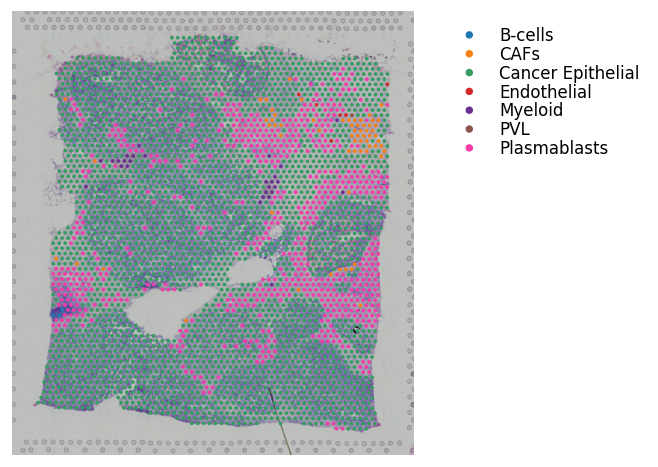
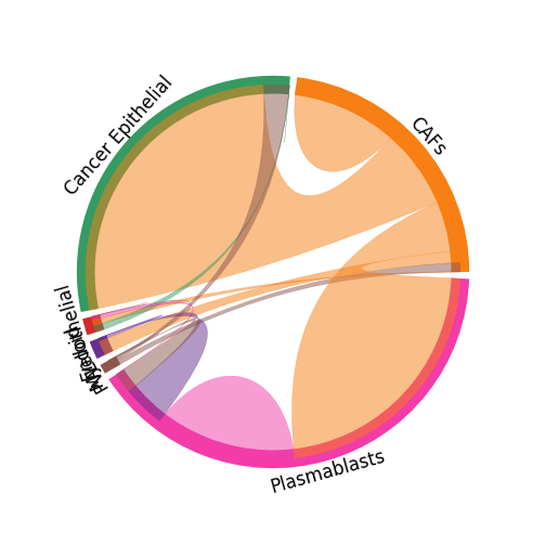
Cell-cell interaction plots
For the stLearn cell-cell interaction analysis, you can display the celltype-celltype interactions between cell types using st.pl.lr_chord_plot.
[31]:
if (not all(key in adata_processed.uns for key in lr_uns_columns) or
    not all(key in adata_processed.obsm for key in lr_obsm_columns)):
        st.tl.cci.run_cci(adata_processed,
                          'cell_type',  # Spot cell information either in data.obs or data.uns
                          min_spots=3,  # Minimum number of spots for LR to be tested.
                          spot_mixtures=True,  # If True will use the label transfer scores,
                          # so spots can have multiple cell types if score>cell_prop_cutoff
                          cell_prop_cutoff=0.2,  # Spot considered to have cell type if score>0.2
                          sig_spots=True,  # Only consider neighbourhoods of spots which had significant LR scores.
                          n_perms=100,  # Permutations of cell information to get background, recommend ~1000
                          n_cpus=4)
[32]:
st.pl.cluster_plot(adata_processed, use_label='cell_type', bbox_to_anchor=(1.6, 1))
st.pl.lr_chord_plot(adata_processed, 'cell_type', lr_pair_of_interest, figsize=(4, 4))
[33]:
# Uncomment to save new version.
# st.tl.cache.write_subset_h5ad(adata_processed, lr_data_path, lr_obsm_columns, lr_uns_columns)